Chapter Summary: Designing and Developing Dashboards with Dash
Dashboards
A dashboard is an interactive report that reflects a set of business metrics essential for managing a company and is updated automatically.
- "Updated automatically": the data used to build a dashboard is regularly (every day/hour/minute) updated. That's why building dashboards is closely related to automation.
- "Interactive": dashboards often have controls for filtering the information displayed. Generally, the data is filtered by time.
- "Set of business metrics": dashboards display information needed to solve business problems.
- "For managing a company": dashboards are used to make business decisions.
Dashboards can be built in various systems, such as Tableau, QlikView, Microsoft Power BI, and Amazon QuickSight. These products are quite similar and don't require any additional code, but they're pretty expensive. Google Data Studio is a free option, but its functionality is limited. To avoid having to pay for commercial systems without limiting our dashboard-building capabilities, we'll use the Dash library in Python.
Dash is a set of Python libraries for building dashboards and displaying them in web browsers. The Dash and plotly libraries are responsible for plotting dashboards, while the micro-framework Flask is responsible for displaying them in browsers.
Here's an example of code for a simple dashboard built in Dash:
1#!/usr/bin/python23import dash4import dash_core_components as dcc5import dash_html_components as html67import plotly.graph_objs as go89import pandas as pd1011# define layout12external_stylesheets = ['https://codepen.io/chriddyp/pen/bWLwgP.css']13app = dash.Dash(__name__, external_stylesheets=external_stylesheets)14app.layout = html.Div(children=[1516 # heading17 html.H1(children = 'Linear function'),1819 # plot20 dcc.Graph(21 figure = {22 'data': [go.Scatter(x = pd.Series(range(-100, 100, 1)),23 y = pd.Series(range(-100, 100, 1)),24 mode = 'lines',25 name = 'linear_func')],26 'layout': go.Layout(xaxis = {'title': 'x'},27 yaxis = {'title': 'y'})28 },29 id = 'linear_func_id'30 ),3132])3334# dashboard's logic35if __name__ == '__main__':36 app.run_server(debug=True)
A dashboard's layout is the graphical part that will display all the dashboard graphs and controls on the page.
Launching a Dashboard on Your Local Machine
How to launch a dashboard on your local machine in the Linux command line:
- Open the Linux command line;
- Create a simple dashboard and save it as
dash_test.py. - Install dash. To do this, you'll need to deploy
pipdistribution. Run the following commands in turn:
1sudo apt update2sudo apt install python3-pip # answer yes to all questions
The first command updates the library with available apps. In Linux the apps are installed in the apt library. By default, pip is not part of the
apt library, so it has to be updated.
The second command python3-pip installs pip for Python3.
The sudo command means that the commands to follow must be run as an administrator. To run the sudo command you'll have to enter your user password. As a rule, it's the same password you use to enter the system.
Run the command to install dash:
1pip3 install dash==1.4.1
Once this is done, go to the folder that stores dash_test.py and run the command:
1python3 dash_test.py
The system will display the following result:

Copy the line [http://127.0.0.1:8050/](http://127.0.0.1:8050/) and open this link in your browser. You'll see a local version of your first dashboard.
Launching a dashboard on a virtual machine is harder, since you'll need to know how to install and set up web servers. In your future job, if you need to deploy dashboards you'll need to turn to system administrators and tell them the secret code: "I need to deploy a Flask app on the Apache server".
Collecting Requirements When Building a Dashboard
Building dashboards requires you to become a business analyst or technical writer for a short time. You'll have to communicate with dashboard customers, collect functional requirements, and draw up technical requirements.
Before building a dashboard, clarify the following details with the customer:
- What business problem the dashboard is supposed to solve, and who the primary user will be
- How often the dashboard is expected to be used
- Dashboard data structure: what metrics (KPI) it should display, what parameters they should be grouped by, what parameters should be used to form user cohorts
- The type of data to be displayed on the dashboard (absolute or relative values or both)
- The sources of data
- The database that will store aggregate data
- How often the data should be updated
- What graphs it should display and in what order
- What controls the dashboard should have
Ideally, customers provide you with explicit technical requirements, but in real life analysts often have to draw them up on their own. At this stage you need to find answers to two questions:
- Is building a dashboard a good way to solve this problem?
- How many dashboards should you build?
Then find out what data you need, what metrics the dashboard needs to illustrate, what kinds of graphs there should be, and what controls and filters the customer will need.
Sketch out a draft dashboard with the customer — a sort of map or model that shows graph types and their relative sizes and positions. You can create a simple table for your draft.
Once you've prepared a draft dashboard and technical requirements it's time to get started on the technical part of the project. At this stage you should ask database administrators what sources you can use. Decide what database will store aggregated data and on which server your dashboard script will run.
Here are the basic elements of any dashboard:
Heading— must tell the user what the dashboard illustratesDashboard description— a brief text describing the problem the dashboard solves and notes on how it functions (if there's anything out of the ordinary)Graphs and diagramsControls
Creating Basic Graphs in Dash
Import dash_html_components as html :
1import dash_html_components as html
The following adds the HTML tag H1 (top-level header), which contains the name of the dashboard:
1html.H1(children = 'The header of the best dashboard made by the best analyst in the world')
If you need to add an image marked with the <img> tag to the dashboard, here's how:
1html.Img(src='image_address')
And if you need text — say, a comment on how the dashboard functions or a header for a control (the <label> tag) — use html.Label():
1html.Label('Your text here')
Study the components of the dash_html_components library here.
Import the dash_core_components library as dcc. This library has the components we need to display graphs and dashboard controls.
1import dash_core_components as dcc
The main dashboard graph goes inside dcc.Graph():
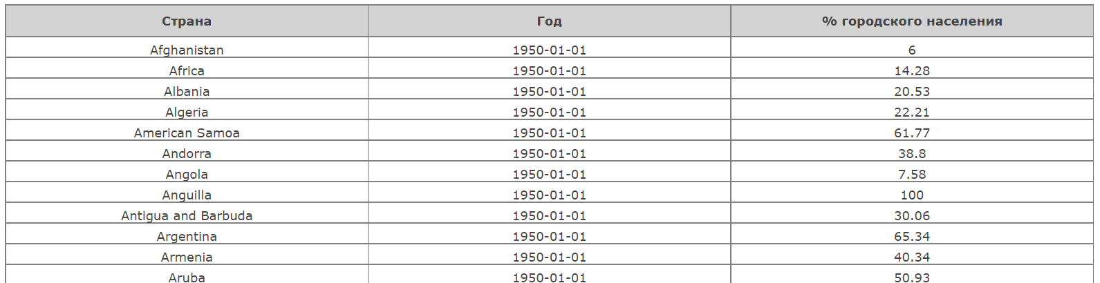
1dcc.Graph(2 figure = {3 'data': [go.Bar(x = max_urbanization['Entity'],4 y = max_urbanization['Urban'],5 name = 'max_urbanization')],6 'layout': go.Layout(xaxis = {'title': 'Country'},7 yaxis = {'title': 'Max % of urban population'})8 },9 id = 'urbanization_by_year'10 ),
dcc.Graph has two parameters:
figuredescribes the graph to be displayed.idis the unique graph name, which you assign. Later, we'll learn to use this parameter to make graphs interactive.
Here's what happens inside figure:
1figure = {2 'data': [go.Bar(x = max_urbanization['Entity'],3 y = max_urbanization['Urban'],4 name = 'max_urbanization')],5 'layout': go.Layout(xaxis = {'title': 'Country'},6 yaxis = {'title': 'Max % of urban population'})7 },
figure has two features:
'data'defines the set of graphs thatdcc.Graphwill display. In this example, we added a bar chart (go.Bar), which has countries along the X axis and the maximum urbanization percentage along the Y axis.gois a link to theplotly.graph_objslibrary (import withimport plotly.graph_objs as go). This lets you add any diagram from the plotly library to your dashboard.'layout'sets parameters for displaying graphs. Here you need to indicate thego.Layoutcomponent to display axis labels. In most cases you won't need anything else.
The content of 'data' is set dynamically; that is, you can create a set of graphs in any part of the program and pass it to the 'data' parameter.
Here's how to draw basic graphs with the plotly.graph_objs library.
go.Scatter draws:
- line charts (
lines) - stacked area charts (
lineswith the parameterstackgroup = 'one') - scatter plots(
markers)
The basic go.Scatter parameters are:
x,y— pd.Series objects (e.g. DataFrame columns), containing values along the X and Y axesmode— the drawing mode, where you indicatelines,lineswith the parameterstackgroup = 'one', ormarkers
[go.Bar](http://go.Bar) draws a bar plot. The basic go.Bar parameters are:
x,y: pd.Series objects (e.g. DataFrame columns) containing values for the X and Y axesbarmodedefines the way two or more datasets will be displayed on a graph:barmode = 'stack'will print one above the other (stacked bar plot)barmode = 'group'will print the datasets side by side
Note that barmode is indicated in the layout section.
go.Pie draws a pie chart. The basic go.Pie parameters are:
labels— a pd.Series object containing the names of the categoriesvalues— a pd.Series containing the values of the categories
go.Box draws box plots. The basic go.Box parameter is:
y— a pd.Series object containing the values of the required variable
go.Table draws tables. The basic go.Table parameters are:
header— the dictionary (dict) of column headers. The header values are passed as an array within thevaluesparameter. For example:1header = {'values': ['<b>Column 1</b>', '<b>Column 2</b>']}
Here <b> is an HTML tag that makes the text bold.
cells— the dictionary (dict) of table cells. The values are passed as an array within thevaluesparameter. Reversing, or transposing, the DataFrame makes it easier to pass its values tocells. This can be done with theToperator:1cells = {'values': your_data_frame.T.values}
Let's look at a simple example of transposition. We have a DataFrame called df:
| Name | Apples | Bananas | Cheese | Oranges |
|---|---|---|---|---|
| Anna | 1 | 5 | 8 | 3 |
| Helen | 10 | 19 | 22 | 21 |
| Jackson | 45 | 34 | 99 | 44 |
Its transposed version (df.T) will look like this:
| Name | Anna | Helen | Jackson |
|---|---|---|---|
| Apples | 1 | 10 | 45 |
| Bananas | 5 | 19 | 34 |
| Cheese | 8 | 22 | 99 |
| Oranges | 3 | 21 | 44 |
Let's look at how to work with a table:
1#!/usr/bin/python23import dash4import dash_core_components as dcc5import dash_html_components as html6from dash.dependencies import Input, Output78import plotly.graph_objs as go910from datetime import datetime1112import pandas as pd1314# retrieving and transforming the data15urbanization = pd.read_csv('data/urbanization.csv')16urbanization['Year'] = pd.to_datetime(urbanization['Year'], format = '%Y')1718urbanization_table = urbanization.copy()19urbanization_table['Year'] = urbanization_table['Year'].dt.date20urbanization_table['Urban'] = urbanization_table['Urban'].round(2)2122# layout23external_stylesheets = ['<https://codepen.io/chriddyp/pen/bWLwgP.css>']24app = dash.Dash(__name__, external_stylesheets=external_stylesheets)25app.layout = html.Div(children=[2627 # urbanization table28 dcc.Graph(29 figure = {30 'data': [go.Table(header = {'values': ['<b>Country or continent</b>',31 '<b>Year</b>',32 '<b>% urban population</b>'],33 'fill_color': 'lightgrey',34 'align': 'center'35 },36 cells = {'values': urbanization_table.T.values})],37 'layout': go.Layout(xaxis = {'title': 'Country or continent'},38 yaxis = {'title': 'Max % urban population'})39 },40 id = 'urbanization_table'41 ),4243])4445if __name__ == '__main__':46 app.run_server(debug=True)
And this will get us the following table:
In addition to basic parameters, the components have a number of other settings (such as line color, etc.). Look at some examples of how they work here.
For more inspiration, check out this gallery of visualizations made with Dash.
The Basics of Working with Controls
All dashboards must be interactive. In other words, it must have controls that make it possible to filter the data being displayed.
Here's the code of a dashboard:
1#!/usr/bin/python23import dash4import dash_core_components as dcc5import dash_html_components as html67import plotly.graph_objs as go89from datetime import datetime1011import pandas as pd1213# retrieving and tranforming data14urbanization = pd.read_csv('data/urbanization.csv')15urbanization['Year'] = pd.to_datetime(urbanization['Year'], format = '%Y')16max_urbanization = (urbanization.groupby('Entity')17 .agg({'Urban': 'max'})18 .reset_index()19 .sort_values(by = 'Urban', ascending = False)20 .head(25))2122# layout23external_stylesheets = ['<https://codepen.io/chriddyp/pen/bWLwgP.css>']24app = dash.Dash(__name__, external_stylesheets=external_stylesheets)25app.layout = html.Div(children=[2627 # creating a header with an HTML tag28 html.H1(children = 'Max urbanization, top-25'),2930 # selecting time range31 html.Label('Time range:'),32 dcc.DatePickerRange(33 start_date = urbanization['Year'].dt.date.min(),34 end_date = urbanization['Year'].dt.date.max(),35 display_format = 'YYYY',36 id = 'dt_selector',37 ),3839 # urbanization graph40 dcc.Graph(41 figure = {42 'data': [go.Bar(x = max_urbanization['Entity'],43 y = max_urbanization['Urban'],44 name = 'max_urbanization')],45 'layout': go.Layout(xaxis = {'title': 'Country'},46 yaxis = {'title': 'Max % of urban population'})47 },48 id = 'urbanization_by_year'49 ),5051])5253# dashboard logic5455if __name__ == '__main__':56 app.run_server(debug=True)
Here's the control itself:
1# time range selection2 html.Label('Time range:'),3 dcc.DatePickerRange(4 start_date = urbanization['Year'].dt.date.min(),5 end_date = urbanization['Year'].dt.date.max(),6 display_format = 'YYYY',7 id = 'dt_selector',8 ),
Here html.Label sets the name of this control. dcc.DatePickerRange, the element itself, is a dialog for selecting start and end dates. The dcc.DatePickerRange control has four parameters:
start_date: the start date. By default it's set to the minimum (first) year of observations:urbanization['Year'].dt.date.min()end_date: the end date. By default it's set to the maximum (last) year of observations:urbanization['Year'].dt.date.max()display_format: the date/time display formatid: the control's unique identifier
Creating a control is easy: you only have to add the object you need from the Dash library to the layout and indicate its parameters and ID. Note that the control's parameters are formed dynamically on the basis of input data: start_date and end_date contain the minimum and maximum date values of the urbanization DataFrame.
Basic Controls in Dash
Here are the most popular controls:
DatePickerRange—an element that selects the time range for which data is displayedChecklist—an element that selects data categories (e.g. a set of countries, game genres, or transaction types)Dropdown—another element that selects data categoriesRadioItems—an element that selects one (and only one) option from a set (e.g. selecting a diagram's display mode)
Selecting a time range:
1dcc.DatePickerRange(start_date = '2016',2 end_date = '2019',3 display_format = 'YYYY',4 id = 'dt_selector', )
start_date and end_date are strings in the format indicated in the display_format parameter.
You can read the documentation for this control here.
Checklists are used when you need to make it possible to choose one or several categories:
1dcc.Checklist( options = [{'label': 'Africa', 'value': 'afr'},2 {'label': 'Eurasia', 'value': 'eur'},3 {'label': 'Australia', 'value': 'au'},4 {'label': 'Americas', 'value': 'am'}],5 value = ['afr', 'eur', 'au', 'am'],6 id = 'continent_selector' )
The array containing the options is given in the options parameter. For each option, label is the value the user sees, and value is its technical value for internal processing. By default, the value parameter contains the values from value.
Documentation here
A dropdown is also used when you need to make it possible to choose one or several categories:
1dcc.Dropdown( options = [{'label': 'Africa', 'value': 'afr'},2 {'label': 'Eurasia', 'value': 'eur'},3 {'label': 'Australia', 'value': 'au'},4 {'label': 'Americas', 'value': 'am'}],5 value = ['afr', 'eur', 'au', 'am'],6 multi = True, id = 'continent_selector' )
The parameters are similar to those for checklists.
The value of the multi parameter determines whether it is possible to select multiple elements from the list.
Documentation here
A radio button is used when one (and only one) option should be selected:
1dcc.RadioItems(options = [{'label': 'Dog', 'value': 'dog'},2 {'label': 'Cat', 'value': 'cat'},3 {'label': 'Opossum', 'value': 'possum'}],4 value = 'possum',5 id = 'pet_selector')
The array containing the options is given in the options parameter. For each option, label is the value the user sees, and value is its technical value for internal processing. By default, the value parameter contains the values from value.
Documentation here
You can read about other types of controls here.
Controls and Interactivity
The dashboard code below has only one control: a radio button. It allows the user to select the function to be displayed (the display mode). Let's take a look at the dashboard's code:
1#!/usr/bin/python23import dash4import dash_core_components as dcc5import dash_html_components as html6import plotly.graph_objs as go78import pandas as pd910from dash.dependencies import Input, Output11import math1213# layout14external_stylesheets = ['<https://codepen.io/chriddyp/pen/bWLwgP.css>']15app = dash.Dash(__name__, external_stylesheets=external_stylesheets)16app.layout = html.Div(children=[1718 # making a header with an HTML tag19 html.H1(children = 'Trigonometric functions'),2021 # selecting the display mode22 html.Label('Display mode:'),23 dcc.RadioItems(24 options = [25 {'label': 'Display sin(x)', 'value': 'sin'},26 {'label': 'Display cos(x)', 'value': 'cos'},27 ],28 value = 'sin',29 id = 'mode_selector'30 ),3132 # graph33 dcc.Graph(34 # the figure parameter is defined dynamically35 id = 'trig_func'36 ),37])3839# dashboard logic40@app.callback(41 [Output('trig_func', 'figure'),42 ],43 [Input('mode_selector', 'value'),44 ])45def update_figures(selected_mode):4647 # making graphs according to the selected mode48 x = range(-100, 100, 1)49 x = [x / 10 for x in x]50 y = [math.sin(x) for x in x]51 if selected_mode == 'cos':52 y = [math.cos(x) for x in x]53 data = [54 go.Scatter(x = pd.Series(x), y = pd.Series(y), mode = 'lines', name = selected_mode + '(x)'),55 ]5657 # defining the result to be displayed58 return (59 {60 'data': data,61 'layout': go.Layout(xaxis = {'title': 'x'},62 yaxis = {'title': 'y'})63 },64 )6566if __name__ == '__main__':67 app.run_server(debug=True)
We import the Dash library components that are responsible for dashboard control signals. Control signals are generated every time the user changes one of the controls.
1from dash.dependencies import Input, Output
In addition to the header, the layout contains two more elements. The first defines a radio button for selecting the display mode,
1html.Label('Display mode:'),2 dcc.RadioItems(3 options = [4 {'label': 'Display sin(x)', 'value': 'sin'},5 {'label': 'Display cos(x)', 'value': 'cos'},6 ],7 value = 'sin',8 id = 'mode_selector'9 ),
and the second specifies the graph that will be displayed on the dashboard.
1# graph2 dcc.Graph(3 # the figure parameter is defined dynamically4 id = 'trig_func'5 ),
This graph doesn't display anything right now, since we don't have the figure parameter. That's because our dashboard will define figure dynamically based on the values the user selects in the controls.
The layout is then followed by this little block of code:
1# dashboard logic2@app.callback(3 [Output('trig_func', 'figure'),4 ],5 [Input('mode_selector', 'value'),6 ])7def update_figures(selected_mode):8 # code of graph update
This is a function for processing controls. Before we study it in detail, let's look at a bit more theory.
Until now you've been working with Python codes that run sequentially. This is synchronous command execution. But Dash uses an asynchronous approach. Here one part of the program generates signals, while the others pick them up and perform actions accordingly. For example, when the user presses a radio button, it generates a signal. update_figures is always waiting for the signal and then responds to it.
1# dashboard logic2@app.callback(3 [Output('trig_func', 'figure'),4 ],5 [Input('mode_selector', 'value'),6 ])7def update_figures(selected_mode):89 # the graphs to be displayed, with filters taken into account10 x = range(-100, 100, 1)11 x = [x / 10 for x in x]12 y = [math.sin(x) for x in x]13 if selected_mode == 'cos':14 y = [math.cos(x) for x in x]15 data = [16 go.Scatter(x = pd.Series(x), y = pd.Series(y), mode = 'lines', name = selected_mode + '(x)'),17 ]1819 # forming the result to be displayed20 return (21 {22 'data': data,23 'layout': go.Layout(xaxis = {'title': 'x'},24 yaxis = {'title': 'y'})25 },26 )
Then there's something called a decorator:
1@app.callback(2 [Output('trig_func', 'figure'),3 ],4 [Input('mode_selector', 'value'),5 ])
Basically, the code below tells the update_figures function what controls will send it signals (Input) and what dashboard elements it must update after the function runs (Output).
1@app.callback(2 [Output('trig_func', 'figure'),3 ],4 [Input('mode_selector', 'value'),5 ])6def update_figures(selected_mode):7…
In our sample code update_figures:
- Is waiting for a signal from the radio button with
id = 'mode_selector'. Whenupdate_figuresreceives a signal, it will take the'value'parameter from the radio button. - Will, after executing, pass its result to the
'figure'parameter of the'trig_func'graph. That's how dashboard graphs get dynamically updated.
Here the selected_mode input parameter will get its value from Input('mode_selector', 'value'). Thus, selected_mode will be equal to value from the control with id = 'mode_selector'.
What do we do if several controls generate signals for a number of graphs? Consider this case:
1@app.callback(2 [Output('plot_1', 'figure'),3 Output('plot_2', 'figure')4 ],5 [Input('control_1', 'value'),6 Input('control_2', 'value'),7 Input('control_3', 'value')8 ])
The dashboard has three elements, with the identifiers control_1, control_2, and control_3, and two graphs with the identifiers plot_1 and plot_2. update_figures must be defined as follows:
1def update_figures(control_1_value, control_2_value, control_3_value):2# forming dynamic graphs3return (4 { # plot_1 graph5 'data': plot_1_data,6 'layout': go.Layout(…)7 },8 { # plot_2 graph9 'data': plot_2_data,10 'layout': go.Layout(…)11 },12 )
The order of the input and output parameters is defined by the order of the given Input and Output elements inside the decorator.
To arrange dashboard elements in accordance with a draft, you need to learn to work with HTML in a process called layout.
Dashboard Elements
Of all the HTML tags, <div> ("division") is the one that interests us most. In its simplest form, this tag logically divides the content of a webpage into blocks, the "bricks" that applications are made of.
Every dashboard on Dash is a webpage, too. Dash displays dashboard elements in the Bootstrap framework. You can find more information about this here.
HTML elements are assigned classes — special names. You can define a general CSS rule for elements that are scattered around a page but share a class, and these elements will be displayed in the same way. Our task is to assign classes that will display div elements as a table and organize them into columns and rows.
We'll need 'row' and 'N columns' classes. They have a special CSS library in Dash. In 'N columns' N is substituted with a numeral which stands for the number of columns (e.g. 'three columns').
Let's look at the following example to get a better idea of how classes work.
1<div>2 <div>One</div>3 <div>Two</div>4 <div>Three</div>5</div>
The above HTML code will display the following result in the browser:
1One2Two3Three
If we apply the Dash classes:
1<div class = 'row'>2 <div class = 'four columns' >One</div>3 <div class = 'four columns' >Two</div>4 <div class = 'four columns' >Three</div>5</div>
We'll get:
1One Two Three
Three div elements with the class 'four columns' (this specifies the width) are organized in a row, since they were placed inside a div element with the row class. That's how div elements are organized into rows and columns.
In Dash, the number of columns in a row is limited to 12. Bear this in mind when specifying classes for columns.
You can read more on how to work with the Bootstrap classes here.
Let's find out how to create <div> tags with the classes we need in Dash. This can be done inside the html.Div element. Let's write a sample code with two columns:
1html.Div([2 html.Div([3 html.Label('I use 9 out of 12 available columns:'),4 ], className = 'nine columns'),5 html.Div([6 html.Label('I use 3 out of 12 available columns:'),7 ], className = 'three columns'),8], className = 'row'),
As you see, we can create <div> HTML tags within html.Div elements inside the dashboard's layout. The classes and width are indicated in the className parameter.
Now let's learn to control the elements' height. The height of <div> depends on the height of its content, so you'll have to set the height of the graphs for which <div> serves as a container. The height is adjusted in the style parameter. It can be set using various units of measurement, but the most convenient way is to use a relative one: % of the page width. This unit is called vw ("viewport width"). For example, if you need to set the graph's height to 25% of the page width, write the following Dash code:
1dcc.Graph(2 style = {'height': '25vw'},3 id = 'sales_by_platform'4)
Finally, let's look at a few more Dash elements that will help make your dashboards more informative and readable.
html.H1 prints out the dashboard header. Here's how it can be used:
1html.H1(children = 'I am a header')
html.Label prints out text:
1html.Label('Lorem ipsum dolor sit amet, consectetur adipiscing elit.')
html.Br lets you add an empty line between two dashboard elements if the elements are too close to one another:
1html.Br()