Chapter Summary: Preparing Presentations
How to Talk About Your Research
Professional data analysts turn numbers and graphs into stories that explain why the data looks the way it does.
Behind every good story are precise data and quality visuals. Remember that data drives the story, not the other way around.
When you’re drawing conclusions based on data, look at everything around it.
Sources for the plot of the story:
- General information about the company and business procedures
- Financial, analytical, and other metrics
- External and internal factors affecting the company
Whom to Tell Your Story To
It’s important to know who will be studying your findings. For example, the audience might be:
- Analysts In this case, prepare a detailed report with code, comments on the code, and a link to your data. Specify exactly what your colleagues want to see, the methods you used for calculations or the results with a bit of explanation.
- Product managers Prepare a detailed presentation of your report as a PowerPoint or PDF. Make sure you include all the major results and conclusions, as well as your own recommendations.
- Senior management The report should contain complete answers to the exact questions your managers have asked.
the further the audience is from data analysis, the simpler the report should be.
Seasonality and External Factors
The popularity of some goods and services varies over the course of the year, and analysts use historical data to check for seasonality. You can study query histories with services like wordstat.
To see if a particular product follows a seasonal pattern, see whether there are significant differences in consumer behavior at different stages of the year. Formulate a hypothesis and check for statistical significance in the difference you’re observing.
The environment and its changes are another important factor for your findings.
Absolute and Relative Values
People generally prefer to work with absolute values: volume, size, the scale of an observed event.
Remember that a relative value is the ratio of two other values. It can help us explain changes in absolute values.
Simpson's Paradox
Sometimes you do everything right but get counterintuitive results, in other words, a paradox.
One example of a counterintuitive phenomenon is Simpson's paradox (also called the Yule–Simpson effect, or the amalgamation paradox).
Here's the essence of Simpson's paradox: a trend observed in two different groups of data either disappears or reverses when you combine the groups. This is usually the result of overlooking hidden data or having control groups that aren’t representative.
To find out what’s underlying a phenomenon, you have to:
- Be skeptical about the data you get and compare it with reality
- Examine other data slices and see whether there’s anything hidden that could be affecting the overall result
- Keep digging until you find an answer about the real relation in the data.
When Graphs Are the Enemy
Graphs can be misleading when there are mistakes in calculations or you pick the wrong way to visualize your information.
- You need to check your calculations and source data to make sure everything’s correct.
- You should always make sure your visualization isn't misleading.
- Choose the right scale for your axes.
- Visualize the data in various ways to shed light on different aspects of it.
- Select a good color for your visualization.
Less is more when it comes to graphs. It's better to break information down into multiple visualizations instead of cramming it all into one graph.
Different Graphs for Different Kinds of Information
Some practical advice for selecting graphs.
Comparisons over time
How many time periods will you need to show?
- If there are a lot, use a line graph.
- If there are only a few (several months, for instance), a bar graph is the better choice.
The distribution of a dataset
Data distribution by category
If you want to track changes over time, build a bar graph. If not, go with a pie chart.
How many variables do you need to show?
- One? A bar graph works, and you can overlay a line graph that shows, for instance, the normal distribution.
- Two? Go with a scatter plot, which is great at showing interrelations within data, too:
Funnels and other specialized graphs
Although these aren’t traditional graphs, you’ll often need to plot them, too. Heatmaps are an example of specialized graphs.
Make sure:
- the color
- is selected in line with the color palette
- won’t make things difficult to understand if the graph gets printed in black and white
- is also visible to people who are colorblind
- contrasts well with the background
- the text
- is legible
- is horizontal
- includes a legend
- The data on the graph is labeled.
- the lines
- of the grid (if there is one) are hidden
- do not have any irrelevant marks on the axes
- include only one vertical axis and one horizontal axis
- The graph is not framed.
- the general layout
- is proportionate
- has evenly spaced axes
- is two-dimensional
- keeps the extra frills to a minimum
Here’s a list of methods that will help you plot informative graphs in Matplotlib.
Use the
set_title()method to give graphs a title:1import matplotlib.pyplot as plt2fig, test = plt.subplots()34test.set_title('Normal distribution')For axis labels, use the
set_xlabel()andset_ylabel()methods:1import matplotlib.pyplot as plt2fig, test = plt.subplots()34test.set_xlabel('Label for X axis')5test.set_ylabel('Label for Y axis')The
legend()method is for the legend:1import matplotlib.pyplot as plt2fig, test = plt.subplots()34test.plot(x, y1, label = 'Label 1')5test.plot(x, y2, label = 'Label 2')6test.plot(x, y3, label = 'Label 3')78test.legend()To modify graph size, we have the
set_figheight()andset_figwidth()methods:1import matplotlib.pyplot as plt2fig, test = plt.subplots()34fig.set_figheight(10) # height5fig.set_figwidth(8) # width
Basics of Making Presentations
Tools
Windows users usually make presentations in PowerPoint, part of Microsoft Office. Alternatives include PowerPoint Online and Libre Office.
macOS users have Keynote.
Most presentations are either .pptx (PowerPoint) or PDF files.
If you’re working on your presentation together with a team or it's for internal use, save it as a .pptx file.
If you’re going to be delivering the presentation yourself, save it as a PDF. That way the style, fonts, and images will show up the way you want them to. While PDFs can be opened from practically any device, .pptx files cannot.
Presentation guidelines
- Specify your topic and research start and end dates on the first slide.
- General findings go at the beginning.
- One idea per slide. Get rid of anything that's irrelevant or confusing.
- Put the key finding in the slide title. It should tell you what to pay attention to and what question the slide will answer
- State your conclusions explicitly.
- Stick to a single storyline. Solve problems one by one. Complete each set of slides in a way that leads your audience to draw the right conclusions.
- Make sure that the data is accurate and that your graphs don't contradict one another.
- Cite the sources you took the data from.
- Put recommendations at the end. They don’t have to be detailed, but they do need to be relevant and clear.
Your company probably has presentation guidelines with their own nuances and requirements. Ask your colleagues or supervisor about this before preparing a presentation.
Reports in the Jupyter Notebook
You’ve already studied cases where your teammates needed reports as Jupyter notebook files. There are two possible formats you can save them in:
- ipynb, the standard file format for the Jupyter Notebook. Your colleague just needs a computer to open your report.
- HTML is good when you don’t have a way to open the Jupyter Notebook (on your phone, for example). The markdown is generated automatically. Saving your notebook in the format you need is easy:
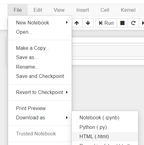
File -> Download as... -> HTML
Here’s a checklist for preparing reports in the Jupyter Notebook:
- If you’re sending an ipynb file, make sure to attach the source data.
- If you’re sending an HTML file, make sure the cells are all filled in correctly so that the tables and graphs appear.
- Specify the purpose of the file in a markdown cell.
- Mark the main steps. Indicate where data is preprocessed, where questions are posed, and where the main findings are presented.
- Insert a table of contents at the beginning of the file.
- List the principal results and findings; this will help readers quickly find the answers to their questions.
- Leave comments in the code, making sure to indicate the meaning and function of each variable.
To make a table of contents select the markdown cell type and enter all the main points of your research as follows:
11. [Opening data]22. [Preprocessing data]3 * [Processing missing values]4 * [Processing duplicates]
Add a link to each markdown cell with the name of the corresponding point:
1<a id="some_id"></a>
Indicate the unique ID of the cell. Add links to the list you've created:
11. [Opening data](#start)22. [Preprocessing data](#preprocessing)3 * [Processing missing values](#null)4 * [Processing duplicate data](#duplicates)
Use Shift + Enter to see the list with links.
It’s good practice to avoid file paths referring to your computer. For example, C://Users//Kitty//research.csv probably won’t open for your teammate.
To avoid confusion, create a variable called path that stores a unique file path, then add the file name:
1import pandas as pd2path = 'C://Users//Kitty//'3df = pd.read_csv(path + 'auto.csv')