Data Visualization
Visualizing data allows us to see patterns and relationships instantaneously, helping us understand the data. It also allows us to form conclusions, ask new questions, and better communicate our findings with other people.
There are two main reasons to create visualizations as a data professional:
- To analyze large amounts of data by revealing its properties visually; in other words, visualize to analyze. By visualizing data, you can gain insight that would be impossible if you were reading through raw numbers.
- To communicate the results of your analysis to your colleagues or clients in a way that is comprehensible and effective.
Choosing the Correct Type of Plot
- Bar chart. Bar charts allow us to compare numeric properties (e.g. population) between categories (e.g. states).
- Histogram. A histogram is a graph that shows how frequently different values appear for a variable in your dataset. While they can resemble bar charts, there are different.
- Line plot. They are great when you have data that is connected chronologically and each time point of data has some dependence on the previous point. Things like temperature data, traffic data, and stock market data are all good candidates for line plots.
- Scatterplot. It is simply a graph where a single point is plotted for each set of variables, but the points are not connected by lines. Scatterplots are a great way to visualize relationships between variables.
Plotting with Pandas
plot() builds graphs using the values in the DataFrame columns. The indices are on the X axis, and the column values are on the Y axis.
1df.plot()
We can change the axes indices, assigning the values from the column we need to the corresponding axis.
1df.plot(x='column_x', y='column_y')
Customizing Figures with plot() Parameters
We can manage the size of the graph with the figsize parameter. The width and height in inches are passed as a tuple:
1df.plot(figsize=(x_size, y_size))
The plot() method also has style parameter that is responsible for how points look:
'o': instead of an unbroken line, each value will be marked as a point'x': instead of an unbroken line, each point will be marked as an x'o-': will show both lines and points
We can fix the borders using the parameters xlim and ylim, which you learned about when studying boxplots:
1df.plot(xlim=(x_min, x_max), ylim=(y_min, y_max))
To display gridlines, set the grid parameter to True:
1df.plot(grid=True)
Using several options together
1data.plot(2 x='days',3 y='revenue',4 style='o-',5 xlim=(0, 30),6 ylim=(0, 120000),7 figsize=(4, 5),8 title='A vs B',9 grid=True)
Saving Figures
The savefig() function can be used to save the last figure.
1import matplotlib.pyplot as plt2import pandas as pd34df = pd.DataFrame({'a':[2, 3, 4, 5], 'b':[4, 9, 16, 25]})56df['b'].plot()7plt.savefig('myplot.png', dpi=300)
Plotting with Matplotlib and Pandas
Probably, the most optimal combination:
- construct a Figure object and an Axes object with
matplotlib, - draw the core of a plot with pandas,
- adjust the plot by calling methods of an Axes and/or an Figure.
1import matplotlib.pyplot as plt2import pandas as pd34df = pd.DataFrame({'a':[2, 3, 4, 5], 'b':[4, 9, 16, 25]})56fig, ax = plt.subplots(figsize=(12, 8))78df.plot(x='days', y='revenue', style='o-', ax=ax)910ax.set_xlim(0, 30)11ax.set_ylim(0, 120000)1213ax.set_title('A vs B')14ax.grid(True)1516fig.savefig('myplot.png', dpi=300)
See many methods for the Axes object here.
Bar Charts
We sometimes use bar charts to plot quantitative data. Each bar on such a plot corresponds to a value: the higher the value, the higher the bar. Differences between values are clearly visible.
In pandas, charts are plotted with the plot() method. Various graph types are passed in the kind parameter. To plot a bar chart, indicate 'bar'.
1import matplotlib.pyplot as plt2import pandas as pd34df = pd.read_csv('/datasets/west_coast_pop.csv')56df.plot(x='year', kind='bar')
Histograms
Key differences between bar charts and histograms:
- Bar charts are used to compare values for discrete variables; histograms are used to plot distributions of continuous numeric variables.
- The order of bars in bar charts can be modified for style or communication; the order of bars in histograms cannot be changed.
In a histogram, the X-axis represents the variable and has the range of values that the variable can take. The Y-axis represents the frequency with which each value occurs.
In pandas, histograms are plotted with the hist() method. It can be applied to a list or a column from a DataFrame, in which case the column is passed as an argument. The hist() method finds the highest and lowest values in a set and breaks the resulting range into equally spaced intervals, or bins. Then the method finds the number of values inside each bin and renders it on the graph. The default number of bins is 10, which can be changed with the bins= parameter.
Another way to plot a histogram is to call the plot() method with the kind='hist' parameter.
Displaying a histogram with 16 bins and minimum and maximum values (min_value and max_value):
1import matplotlib.pyplot as plt2import pandas as pd34df['age'].hist(bins=16, range=(0, 120)
Several histograms can be displayed on a single chart.
1import matplotlib.pyplot as plt2import pandas as pd34df = pd.read_csv('/datasets/height_weight.csv')56df[df['male'] == 1]['height'].plot(kind='hist', bins=30)7# Include an alpha value so we can fully see both histograms8df[df['male'] == 0]['height'].plot(kind='hist', bins=30, alpha=0.8)910plt.legend(['Male', 'Female'])
In the interactive below, see how different distributions will be binned in the histogram. You can add your own data by clicking and even change the size of the bins.
Boxplots
When describing a distribution, analysts calculate the mean or median. You learned about the mean() and median() methods in the course on Data Preprocessing. Besides the mean and median, it's also important to know the dispersion: which values and how many of them are far from the average.
The easiest way to get a sense of the dispersion is to look at the minimum and maximum values, but if there are outliers, this won't tell you much. It's much better to look at the interquartile range.
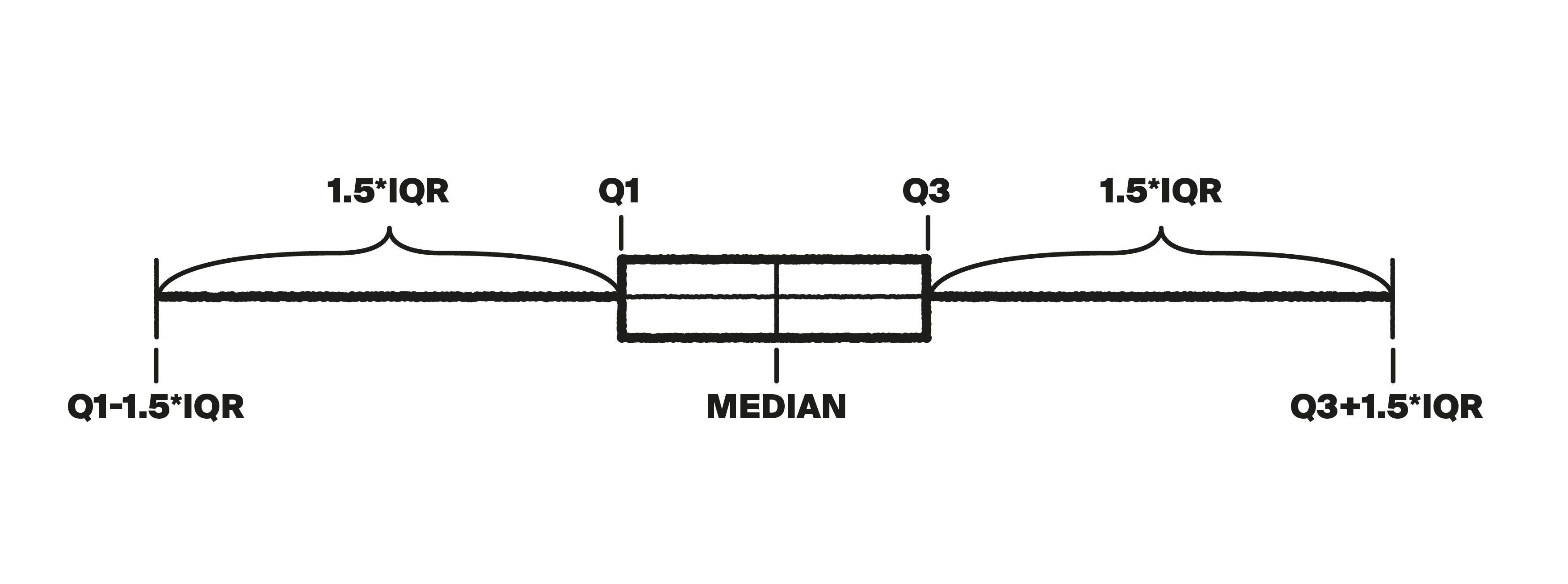
Quartiles (from the Latin quartus, or quarter) break up ordered sets of data into four parts. The first quartile, or Q1, marks the value greater than 25% of the dataset's elements and less than 75%. The median is Q2; here the elements are split in two. Q3 is greater than 75% of the elements and less than 25%. The interquartile range is everything that falls between Q1 and Q3.
We can find the median and quartiles in Python using a special graph called a boxplot, or box-and-whisker plot.
The box stretches from the first to the third quartile, and the median is drawn inside of it.
The whiskers extend a maximum of 1.5 interquartile ranges (IQR) to the left and right of the box. (Each whisker goes to the largest value that falls within this range.) Typical values fall within the whiskers, while outliers are displayed as points outside of them.
Python has a boxplot() method for creating these plots:
1df['column'].boxplot()
Line Plots
1import matplotlib.pyplot as plt2import pandas as pd34df = pd.read_csv('sbux.csv')56df.plot(x='date', y='open')
Scatterplots
There can be so many points that many of them are overlapping, so we can’t get a good feel for the density of points in the above plots. It can be fixed by using the alpha= parameter. This parameter controls the transparency of the points and can take any value between 0 (full transparency) and 1 (no transparency). By default, it’s set to 1 and there is no transparency.
1import matplotlib.pyplot as plt2import pandas as pd34df = pd.read_csv('/datasets/height_weight.csv')56df.plot(x='height', y='weight', kind='scatter', alpha=0.36)
Scatter Matrices
We can build scatterplots for every possible pair of parameters. This set of pairwise plots is called a scatter matrix.
1import matplotlib.pyplot as plt2import pandas as pd34df = pd.read_csv('/datasets/height_weight.csv')56pd.plotting.scatter_matrix(df, figsize=(9, 9))