Estimating Distribution with Histograms
Building Frequency Histograms
One way to visualize the distribution of continuous variables is to divide the set of possible values into intervals and count the number of values in each interval. We can do this in pandas by setting the number of intervals (bins) explicitly:
1data.hist(bins=20)
It’s good to remember that the success of this approach does depend on how well you choose the bounds of the interval.
Another way to overcome the difficulties of creating a histogram for a continuous variable is to use a density histogram.
Building Density Histograms
A density histogram represents frequency not as the height of a column, but as its area. This area is the frequency of the continuous variable, and the height of the column is the frequency density.
If you want to estimate how many values fall in a particular interval just take two values and find the total area of the density histograms between them. The number you get will be an estimate of the number of values in that interval.
Using the same principle we can also display the frequency density for continuous variables using continuous lines, since the area under the curve between two values is proportional to the frequency of the values in a given interval.
Now that we know what is in the dataset, the next step is to find out where it is located.
But what happens if our outliers make our data look askew?
Skewed Data
In many cases data is distributed normally and symmetrically, but some datasets can also be asymmetrical, or "skewed," in either a positive or negative direction. It’s pretty easy to recognize skew if you look at a histogram since there will be a tail to one side of the “bulk” of the data.
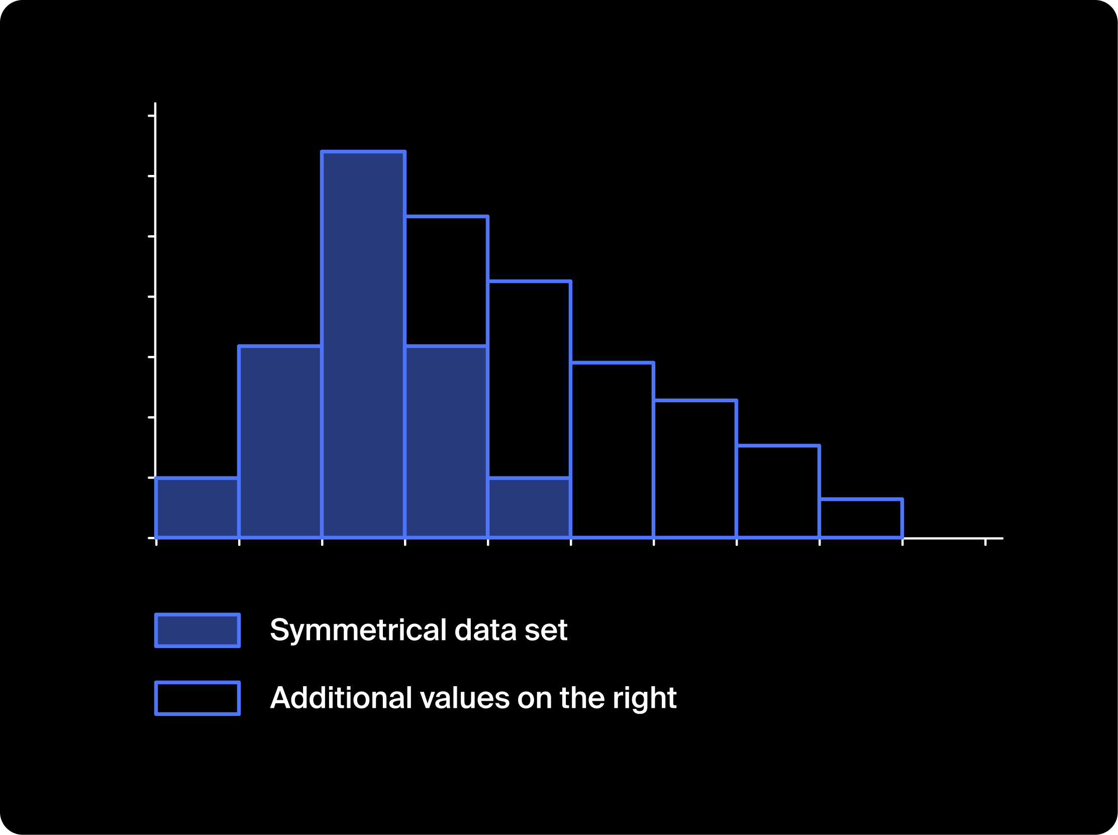
A data distribution with additional values on the right is said to skew to the right. This is often called positive skew. And when a dataset has additional values on the left is said to skew to the left, or to have negative skew.
Box plots also show the skew of a distribution.
We can also determine skew without plotting graphs, simply by comparing the mean and the median. Since median is not affected by outliers as much as the mean, if the mean is greater than the median for datasets it will skew to the right, and vice versa for datasets skewed to the left.